Emotional Color Harmony – How to Use Color to Convey Mood in Landscape Art
- May 30, 2025
- 3 min read
Color isn’t just a tool — it’s an emotional language. This week’s focus, emotional color harmony, explores how subtle shifts in hue, temperature, and saturation can transform the atmosphere of a landscape painting. Whether you’re drawn to misty greys or glowing twilight oranges, your color palette holds the power to shape not just how your scene looks, but how it feels.
Many artists instinctively copy the colors in a reference photo, but to create emotional resonance, we need to interpret those colors — amplify, simplify, or even shift them. This is what turns a study into a statement. If you’ve read Painting Light and Shadow or Why Copying Photos Doesn’t Work, this post will help you move from observing color to expressing with color.
Artistic Value of Emotional Color Harmony
When we talk about color mood, we’re really asking: what do these colors feel like — and how can I use them to say something?
Unlike realism, emotional color harmony doesn’t rely on copying what’s “true.” It relies on designing a palette that evokes a specific mood — calm, mystery, joy, melancholy, awe — using visual tools like:
Temperature (warm vs. cool)
Saturation (vibrant vs. muted)
Value (light vs. dark)
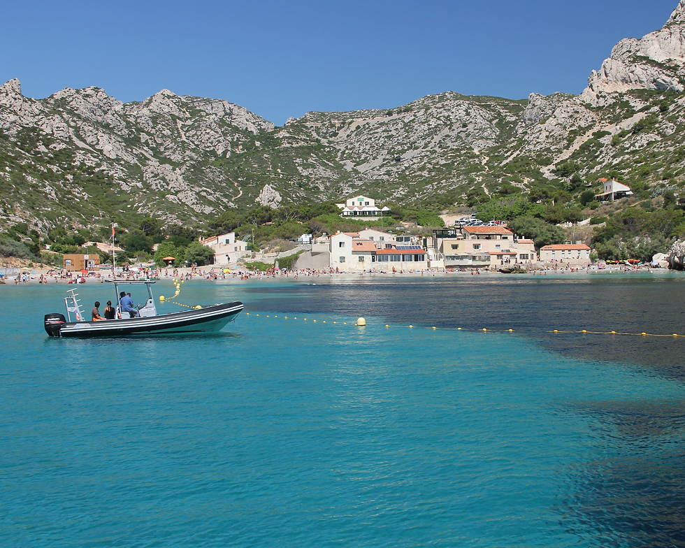
This week’s reference photos — all showing the same town view in Normandy at different times and conditions — are a perfect case study. Each version of the same location has its own mood, from golden serenity to moody twilight or magical pink dusk.
The key lies in controlling and limiting your palette. Choose a temperature base (cool blues, warm peach, misty neutrals) and then layer in saturation or soft gradation to guide the emotional tone. Don’t be afraid to shift colors away from what the camera sees and closer to what your heart wants to express.
Neutrals play a big role too. Greys, browns, and desaturated tones allow your main color statements to shine and give space for contrast. When everything is saturated, nothing is emphasized — but when used intentionally, harmony can sing.
Masterpiece Analysis
Few artists have explored emotional color harmony with more precision than Claude Monet, particularly in his Houses of Parliament series. What’s remarkable is how three versions of the same scene — same subject, same angle, similar time of day — feel completely different, just by changing the color palette.

This version features rich violet shadows and a soft ochre-yellow sky. The combination is muted and balanced, evoking a feeling of calm introspection. The sun is a gentle glow rather than a dramatic blaze. The mood is thoughtful, quiet — perhaps even solemn.

Here, Monet uses a cool lavender-pink haze. The sky feels soft and humid, and the red sun appears like a ghostly eye through fog. The emotion is more mysterious, even tender — the color harmony creating a dreamlike veil. There's less contrast and more blend, giving the work a romantic, ethereal tone.

This time, fiery oranges and glowing reds dominate the sky and its reflection in the water. The architecture becomes a silhouette as color takes the lead. The emotional tone is bold, even overwhelming — suggesting awe, intensity, or transformation. It’s the same place, yet it feels like the world is on fire.
Each painting is a lesson in mood-building. Not through structure. Not through detail. But through color alone.
Quick Guide: How to Make Emotional Color Harmony
Creating emotional color harmony starts with clarity of intent. Ask yourself: “What do I want this scene to feel like?”
5 Practical Tips to Make Emotional Color Harmony🔲 Limit your palette to 2–3 core hues. 🔲 Use muted tones to support saturated accents. 🔲 Shift neutrals slightly warm or cool for subtle emotion. 🔲 Balance temperature shifts in sky and land. 🔲 Use glazing or layering to create color depth. |
5 Reflection Questions:
What’s the overall emotional tone I want to convey?
Are my colors supporting or distracting from the mood?
Do my temperature shifts feel intentional?
Have I overused saturation or contrast?
Can simplifying my palette strengthen the mood?
Want more guidance on expressive landscapes? Check out the posts on Light and Shadow and Limiting Your Color Palette. Both are essential companions to mastering color mood.
To keep practicing, explore the Sunset and other categories in the Reference Library. These offer scenes full of light shifts and emotional potential.


Comments