Mastering Autumn Light with a Limited Color Palette (Weekly Challenge #189)
- Nov 21, 2025
- 4 min read
Updated: Jan 12
This week, we head north to the golden woodlands and shimmering lakes of Langesø, Morud, Denmark — a quiet, fairy-tale corner of the world where autumn wraps the forest in brilliant flame. Every photo this week glows with vibrant reds, amber light, and the stillness of mirrored reflections. It’s a warm and inviting palette, but also a challenge to simplify.
The landscape around Langesø Lake is one of Denmark’s hidden gems. It’s a place of dense deciduous forests, winding trails, and calm waters that reflect everything back — branches, clouds, and the seasons themselves. Capturing this richness with fewer pigments might seem counterintuitive, but that’s exactly our challenge.
A huge thank you to our co-host and photo contributor this week, @artbynannalise, for sharing these vibrant autumn references.
Last time we explored a limited palette, it was all about muted earth tones in Kenya’s Samburu reserve (see Weekly Challenge #159). This week flips the mood — bold fall foliage, glowing skies, and crisp air. Let’s see what happens when we limit our palette but dial up the brightness.
Focus Point: Limited Color Palette
Using a limited color palette means choosing just a few pigments and working within that constraint to build a cohesive painting. It’s less about copying colors exactly and more about unifying your scene, clarifying your story, and making your color choices intentional.
Benefits of a limited palette include:
Stronger color harmony
Clearer value structure
More efficient and expressive decision-making
Reduced risk of overmixing or muddiness
You might work with a warm triad (e.g., yellow ochre, cadmium red, ultramarine blue) or go even simpler — just one warm, one cool, and white. These references offer you the perfect excuse to simplify while still exploring vibrancy!
Want a deeper dive into the theory? Read my post Get Out of the Box with a Limited Palette – Less Colors, More Impact
Analyzing the Reference Photos
Let's breakdown the references of this week.
Photo 1: Leaning Tree Over Autumn Reflections
A strong diagonal tree frames the glowing canopy, reflected in calm water. The variety of red-oranges is captivating — but also overwhelming if copied too literally.

Challenge as a Photo: Balancing warmth without losing clarity will require you to group and simplify color.
Focus Questions:
Can you simplify the leaves into 2–3 tone families?
How much detail do you want to show in the reflection?
Will the tree be a warm or neutral tone?
Tips:
Build color groups: golden lights, warm reds, neutral greens.
Use soft transitions in water for harmony.
Try a limited warm palette: red ochre, lemon yellow, ultramarine.
Photo 2: Lake Scene with Orange Canopy
A quiet lake stretches under a dense crown of trees in full autumn glow. Everything is gently lit and tonally close.

Challenge as a Photo: The harmony risks turning too “samey” — you’ll need variation in value and temperature.
Focus Questions:
What contrast can you build between sky, trees, and water?
Could you push shadows cooler for depth?
Tips:
Introduce cool violets or blue grays into shadow zones.
Use warm and cool versions of the same hue to separate layers.
Keep one section slightly desaturated to balance vibrancy.
Photo 3: Forest Path in Golden Light
The deepest autumnal moment — golden trees line the path with filtered light and layered branches.

Challenge as a Photo: This scene risks looking flat due to color similarity and vertical repetition.
Focus Questions:
How can you vary temperature to suggest light vs. shadow?
Can you keep the light airy without washing out values?
Tips:
Focus on value hierarchy first — sketch a grayscale version.
Introduce purple or neutral accents in the background.
Use directional brushwork to echo the flow of the path.
Photo 4: Mirror Lake with Blue Sky
A clean, symmetrical shot — trees on the shore reflect perfectly below a sky dotted with soft clouds.
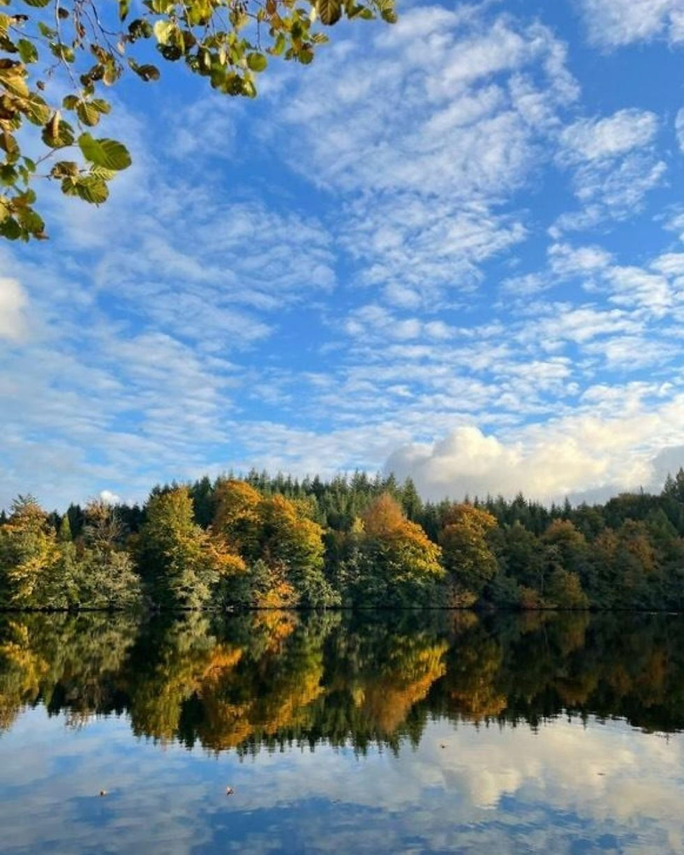
Challenge as a Photo: It’s easy to over-complicate the sky and flatten the water unless you simplify tone families.
Focus Questions:
Will you include both sky and reflection equally?
How can a simple blue + gold palette enhance the design?
Tips:
Use a split palette: ultramarine + burnt sienna + white.
Soften the reflection with horizontal strokes.
Allow color intensity to drop as it recedes.
This is a week to explore balance. How much color do you really need to make a landscape feel alive? How far can you go with fewer pigments and bolder decisions? Whether you're creating crisp color contrasts or layering harmonious tones, try simplifying first — then express with confidence.
Post your painting on Instagram by Thursday, 29 November 2025 at 23:59 CET, using the hashtag #landscapeartclub189 and tagging @landscapeartclub.
Want more ideas? Check our Reference Library, try the “Autumn,” “Forests,” or “Water” categories for more limited-palette practice.
Fewer colors, bolder choices — happy painting!


Comments